
Deloitte University Website
The website design for Deloitte's new educational facility in Westlake, Texas, outside Dallas. After a couple years of designing applications and website that strictly adhered to the firm's branding standards, I was asked to come up with a design that looked more like a resort or hotel website than a standard Deloitte website.
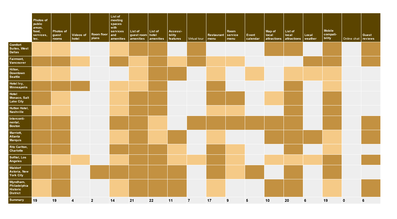
A. Hotel Website Feature Comparison
In the early stages I had to help determine what features the site should offer. Certain pieces of functionality were givens: a system for creating events, sending event invitations, and for invitees to accept or decline. Also critical was a dashboard-like page or pages for guests to see all their room reservation, transportation and event info. In addition, pages with info about the onsite amenities, DU news and events, local attractions, campus layout and ways to contact the university were a given.
But there were a lot of ideas for other pages and features that we weren't so sure about. Online chat? Guest reviews? Interactive tour? Online ordering of meals? To help separate the features a business traveler would expect from those we could safely omit – at least in the 1.0 version of the site – I created this feature grid.
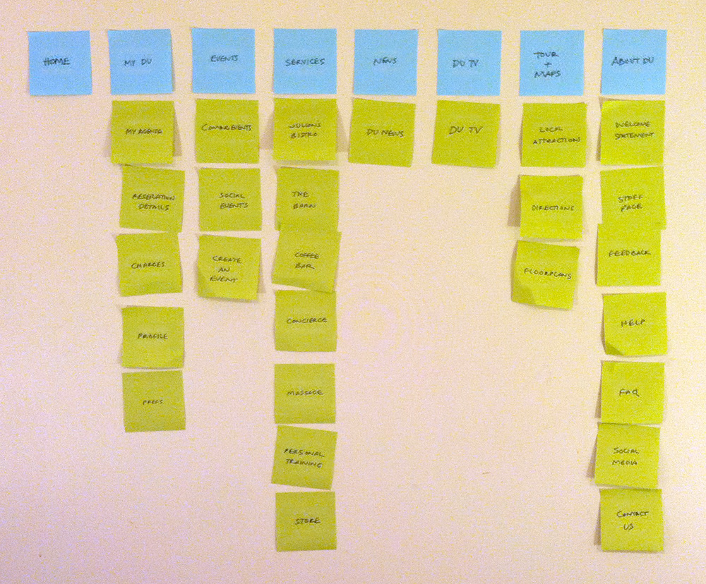
B. Information Architecture
My Post-it-based IA diagram. Not exactly the final hierarchy, but close.
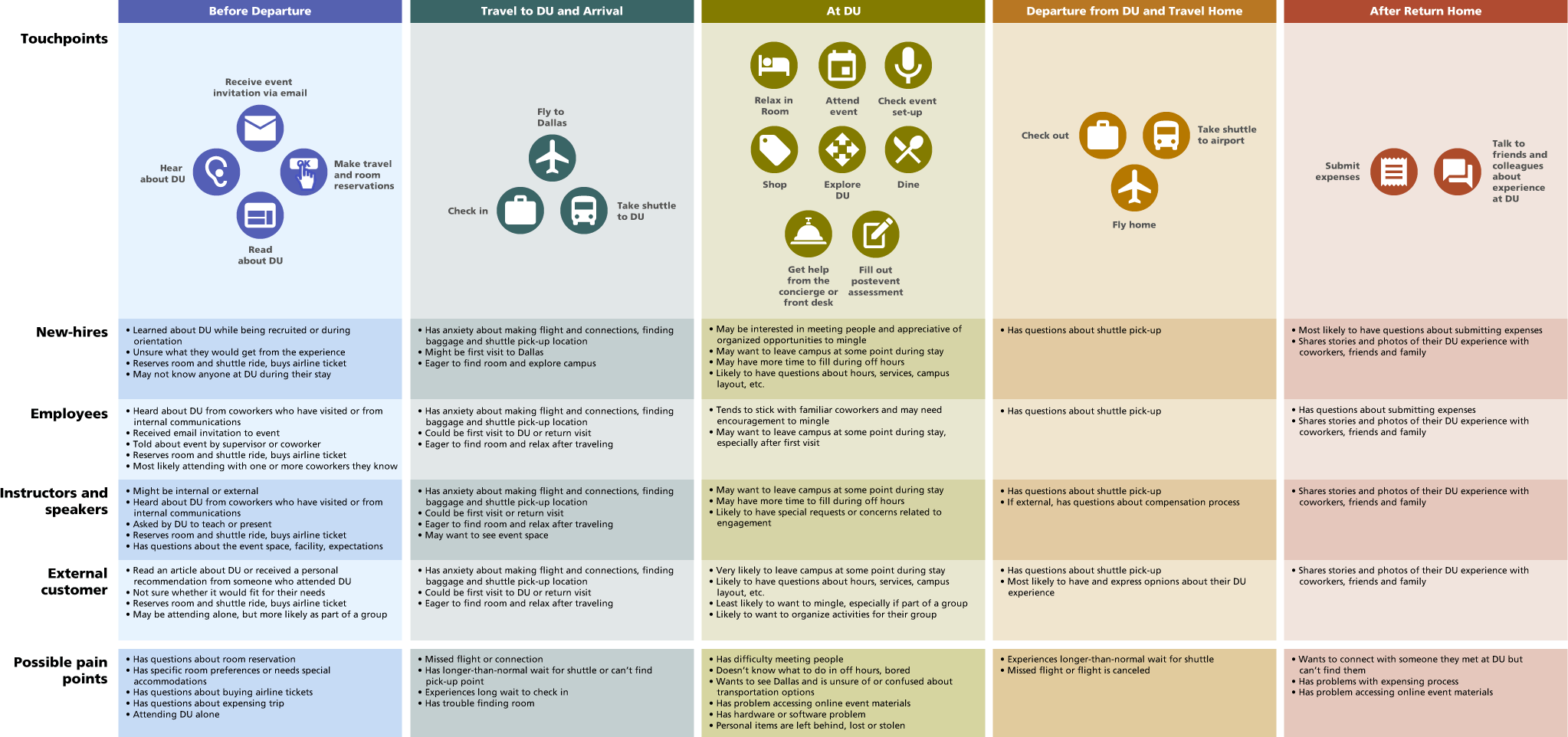
C. DU Experience Map
An attempt at a predictive map of the DU experience created nine months before the facility opened. Organized by four key user groups and five phases.
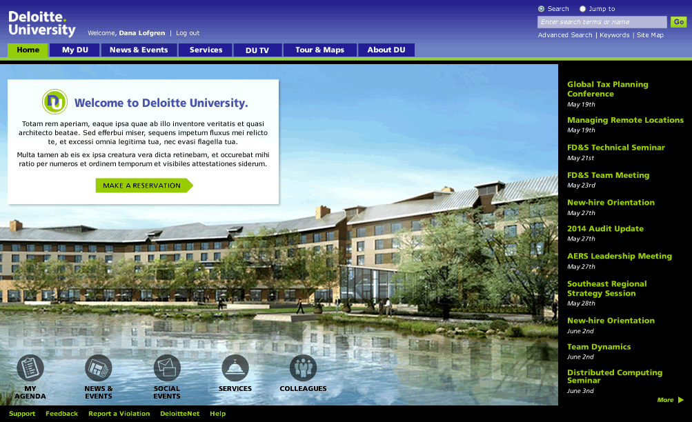
D. Home Page
We determined that since event attendance was to be based on invitations, and since invitations with links to the online registration system were to be sent via email, most visitors probably would not enter the site by means of the home page. Still, for those who did come to the site through the "front door", and for anyone else who clicked on the Home tab out of curiosity, we wanted to convey the feeling of a recreational destination, not a business conference center.
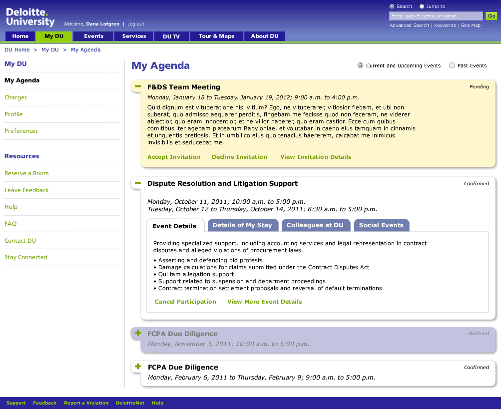
E. My Agenda (Guest Travel and Reservation Info)
One early misstep was splitting guest information (room reservations, transportation arrangements and event details) into three or four pages because of concern over load times. When this IA was criticized for requiring too many clicks, we settled on a design that consolidated all guest info on one page (My Agenda). Event sections are closed by default, with the exception of pending events. Within each event section there are separate tabs for each type of data. Each event section’s data loads only when it’s expanded, and each tab’s data loads only when it’s selected and made visible. Together these two strategies kept load times and system calls manageable.
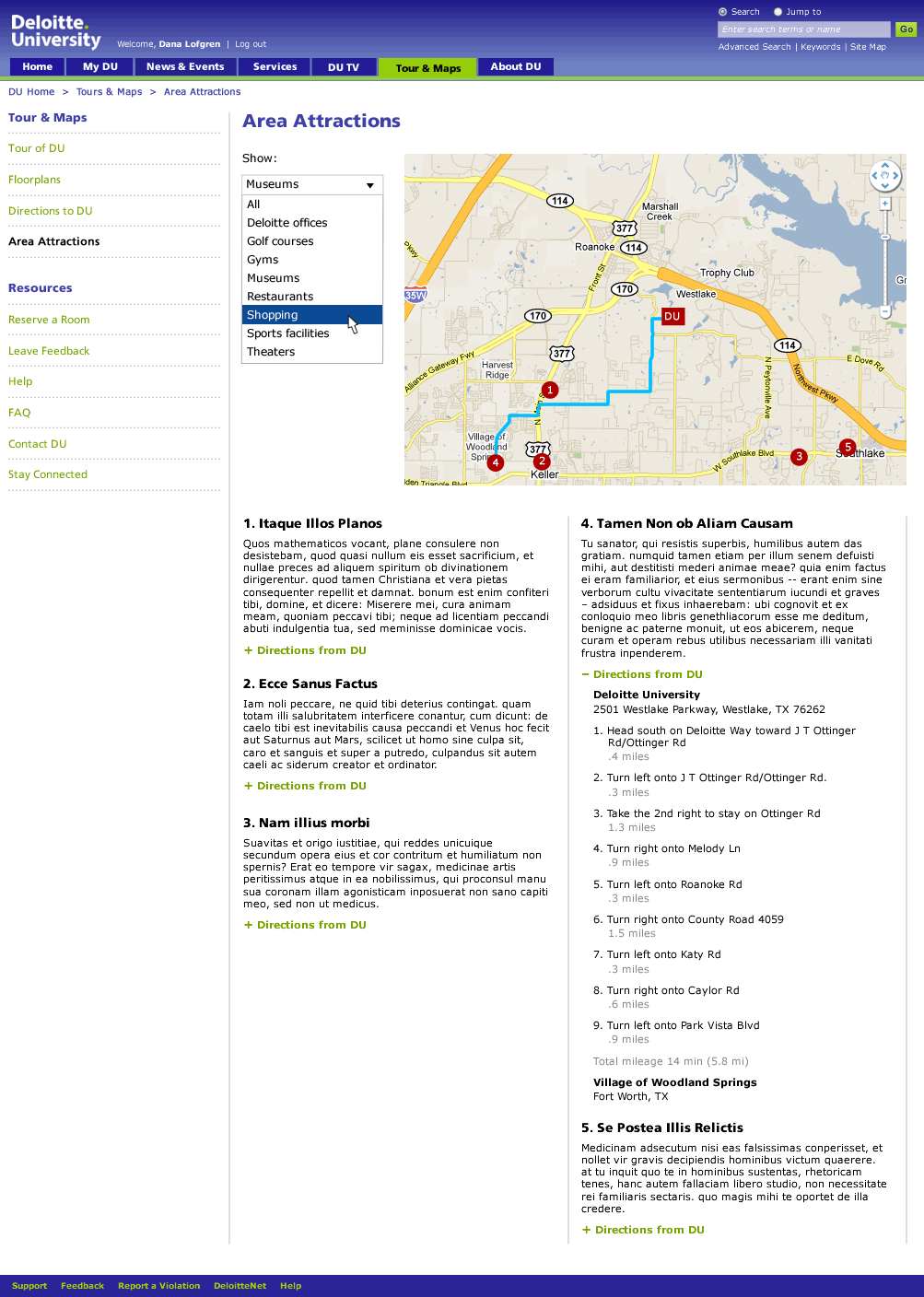
F. Local Attractions with Interactive Map

G. Interactive Campus Tour